
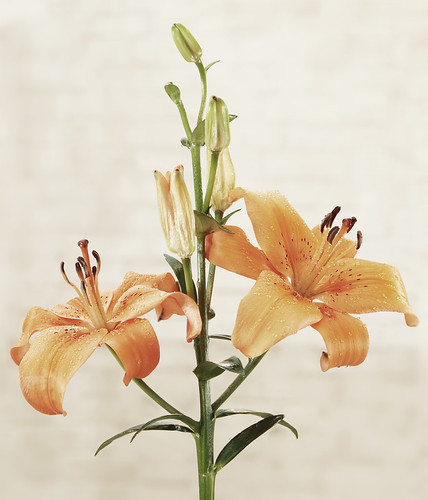
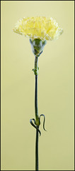
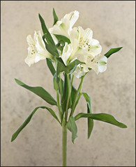
In these three photos, I was trying to create shots of these flowers that really highlighted the details of the flowers. Unlike my recent rose image, I wanted to capture the flowers in as much clarity as I could muster with the gear that I have available. It's worth clicking through to Flickr to see the full size versions of these.
The remainder of this post gives a bit of an overview of how what I did.
In all these photos, there were basically three main factors that contributed to the final result:
- Lighting arrangement
- "Hyper-real" Photoshop effect
- Colour balance and saturation
Lighting
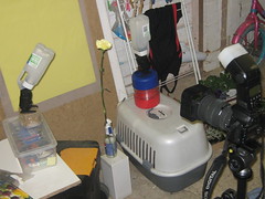
The lighting for all of these shots was a combination of flash (strobe) and ambient light. The flashes were set up on either side of the flower(s) and softened a little using plastic milk bottles. The ambient light came from the transparent roof of the "lean-to" room that I was using. Both the flash lighting and the ambient lighting were set to slightly overexpose (but no too much to avoid too many burned out highlights).
Here is a photo that shows the setup for the carnation shot - the setups for the other two used basically the same arrangement.
"Hyper-real" Photoshop effect
The most common basic way of creating what seems to be commonly called a "hyper-real" effect is to create a duplicate of the background layer, run it through the "High-Pass" filter (normally with a radius in the range of 20 to 40 px or so, depending on the resolution of your image, how much detail there is in the subject and the exact effect you are looking for) and then setting the blend mode to Overlay or Soft Light (again depending on the exact effect you are looking for).
This was the technique I used for each of these images with the exception of the orange lily shot where I used a second shot, with a slightly lower exposure, as the overlay layer rather than using a high-pass filtered layer. This also meant that I had to lower the opacity somewhat (in this case to about 40%) to stop the effect from becoming too extreme.
Colour balance and saturation
In all of these shots, I wanted relatively muted colours, so I used Hue / Saturation adjustments to desaturate the colours to some extent. In particular, with the photo of the white flowers, the background came out a rather orangy-brown sort of colour so I used desaturated the reds and yellows to desaturate it until it was almost grey. In this shot I also used a white balance setting in the RAW converter that added a bit of an overall orange cast.
Other bits and pieces
There were other bits and pieces of processing that I needed to do - for example, in the orange lily shot the brickwork in the background was not quite a blurred as I wanted, and it also had some darker patches that stood out a bit too much, so I did a bit of selective blurring and retouching.
No comments:
Post a Comment