
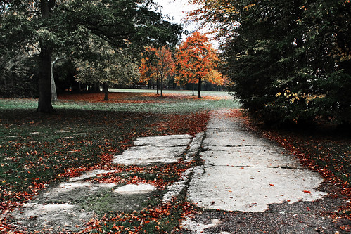
This is from a series on photos that I took on a photo expedition to the local park with my sister early one morning this past week. She was in the area, and we wanted to capture some of the autumn (fall) colours.
The version you see above is the final image after post-processing - the remainder of this post shows the original photo out of the camera and brief details of the post-processing that I used to get to the final version.
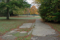
Here is the original version from the camera (Canon 350D; Sigma 24-70 f2.8 lens; ISO100; f11; 5s; manual exposure and focus modes):
The editing process was rather iterative as I tried various options to get the look that I was going for, but final process was broadly as follows:
- Step 1: In Digital Photo Pro (Canon's RAW processor):
- Reduced the exposure slightly (I tend to try to "expose to the right" by over exposing slightly as this helps to minimise noise)
- Set the white balance to "shade" (which was the one that gave colours that I liked most)
- Set Picture Style to landscape (again that was the one that gave the best colours)
- Added a bit of sharpening
- Step 2: Took the processed file into Photoshop to do the rest of the editing...
- Step 3: Used a Selective Color adjustment layer: strengthened the Reds a little (removed Cyan and added a bit of Magenta and Yellow) -- desaturated and darkened the Greens (added Magenta, subracted Yellow, added Black) -- Brightened the Whites (subtrated Black)
- Step 4: Also added a Hue/Saturation adjustment layer: saturated the reds a little more, and desaturated the greens and yellows some more.
- Step 5: At this stage the reds of the tree was a bit too strong compared to the reds of the leaves in the forground, so I used another Hue/Saturation adjustment layer with a layer mask to desaturate the reds in that area only a little.
- Step 6: Added a Curves adjustment layer with a layer mask to "dodge" (lighten) various parts of the image (mainly parts of the concrete path). I set the mode of this layer to Luminosity to avoid affecting the colours.
- Step 7: Added another Curves adjustment layer with a layer mask to "burn in" (darken) some bits (maily the grass on either side of the path). Again this was set to Luminosity mode.
- Step 8: Created a duplicate of the original photo, ran the High-Pass filter with a reasonably high radius (65px), desaturated the result and set the mode to Overlay. The effect of this was too strong in some areas (particularly around the red tree and the sky), so I toned some areas of it down a bit with a layer mask.
- Step 9: At this point I noticed that there were some bright white signs right in the background that needed to be removed, so I created a blank layer and used that to retouch them out.
- Step 10: Added another overall Curves adjustment layer to boost the overall contrast a bit more.
- Step 11: I couldn't quite get the effect that I was looking for with the Curves layer, so I reduced the opacity of that layer and added in a further layer - this one was taken from the black channel of the original image set to CMYK mode and its mode was set to Multiply - again the effect at 100% was too strong, so I reduced the opacity to around 50% or so.
To be honest, I think that those last few steps (8, 10 & 11) were probably a little more fiddly than was really necessary - I probably could have got the contrasty result I was looking for without quite so many layers / steps, but hey - I got a result that I was happy enough with, so I didn't bother to go back and try another approach!
No comments:
Post a Comment