== Love Photography == Delight in Light ==

Wednesday, 28 October 2009

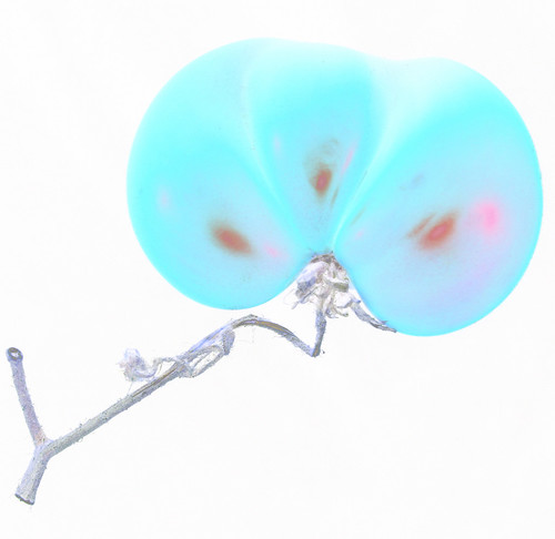
Blue Tomato

Blue Tomato

This is an image that I created from a rather deformed tomato that was one of the fruits of the family's tentative adventures into vegetable gardening... Its unusual shape caught my eye, so I thought I'd have a go seeing if I could create something interesting with it. I had also been looking for a good excuse to play with my new Gitzo Explorer tripod :)

This image has obviously been "Photoshopped" - the remainder of this post shows the original, unedited photo along with details of how I arrived at this final result.

Saturday, 10 October 2009

Tripod Test / Review

In a slight change from past posts, I thought I'd share the results of some tests that I did on some tripods. The background was that I was looking at getting a new tripod to replace my very old Slik 504QF. I was surprised to find, while doing some searching on the Internet, that although I could find various reviews of different models, I found it really difficult to find any comparisons of shots taken on different tripod models to compare the actual final results. Most reviews were just based on the ease of use, cost, weight, etc. and only general comments on the overall stability.

Wednesday, 19 August 2009

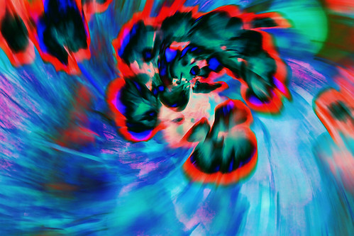
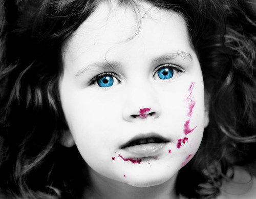
Creative Colour with Flowers, Eyes and Jam

Colour Burst

Blue Eyes & Jam

I created these two images as an entry to a photo competition with the theme "creative colour". I didn't win anything, but thought you may be interested in hearing how they were done anyway!

The images above are the final versions after editing - the remainder of this post gives the basic details of the post-processing that I used for each of them.

Monday, 27 April 2009

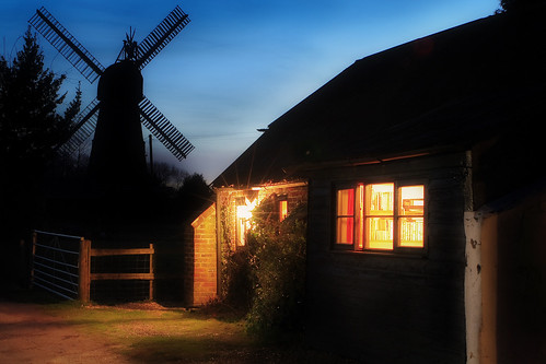
Cozy Mill Barn

Windmill Barn

I read an article in Range Finder magazine recently about a studio that specializes in architectural photography called Attic Fire, and I was inspired by their approach to architectural photography. So, when I was on holiday in March, I thought I'd see if I could produce an image of the converted barn that we were staying in that was a bit more interesting than the normal straight shot.

The process of creating the final image was as follows:

  • I took a series of photos as the daylight faded into dusk so that I got a range of different lighting effects in the sky and on the barn. I also took a couple of shots in which I lit the side of the barn slightly with an off-camera flash to bring out the detail in the dark wood wall a little. The flash was propped on the roof of my car (well, minibus actually) just off to the left of the photo .
  • When I got back home after the holiday, I chose a selection of the photos (which I had taken in RAW) and processed them into JPEG in DPP (Canon RAW converter).
  • I combined the photos in Photoshop using layer masks to give the photo an overall "glowing" sort of appearance.
  • I made a copy of the flattened image, sharpened it, and overlaid that with a blurred copy of the same image at 15% opacity to give a soft focus effect.
  • Finally I tweaked the saturation a bit with a Hue/Saturation adjustment layer.

Wednesday, 18 July 2007

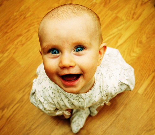
Grinning Baby

Baby Smile

This is a photo of my youngest daughter taken a little while ago. She is actually sitting on the floor - although her legs were a bit obscured by the fact that she was leaning forward so it does look more like she was standing!

Here's a quick summary of how I did it:

  • I was wanting a high viewpoint, so I popped my her on the floor (she could sit but not crawl at that stage - ideal for this sort of thing!) and, using a wide-angle lens, took a few photos of her from close above her head. I played a kind of "peek-a-boo" game with the camera to get the giggles.
  • The lighting was very simple - just an on-camera flash (strobe) rotated around so that the light bounced off the ceiling (if you view the large version of the photo on Flickr you can just about see the reflection of the camera and flash in her eyes).
  • I selected the best image and adjusted it in Photoshop as follows:
    • I used a curves adjustment layer to get the colour effect. I wanted a fairly high-contrast kind of look, so I started off by adjusting each of the RGB curves so that the curve slope for that was steepest in the zones corresponding to the main detail in the photo. Then I played around with the curves a bit more until I got an overall colour cast that I liked.
    • I made a selection of the blue part of the eyes (from the original photo), enhanced the blue colour a bit (again using curves), and then superimposed them over the rest of image to get the blue of her eyes to really stand out.

Thursday, 12 July 2007

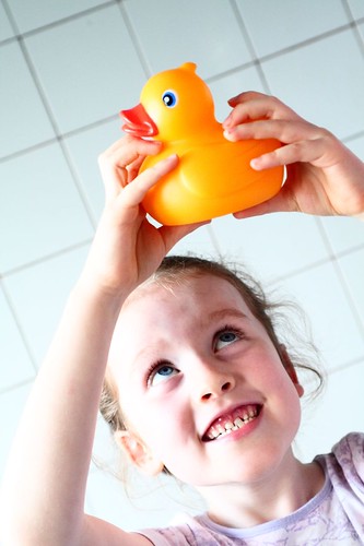
Me & My Ducky

Hello Duckie

This is a photo of my daughter dancing around with a rubber ducky. I wanted to have a dynamic composition (to match her rather manic expression!), so I placed her head low in the frame and held the camera at an angle (as you can tell from the wall tiles).

The lighting for the photo was simply window light from the bathroom window. Post processing involved playing around with curves and contrast a little in the RAW processing software that came with the camera (Canon Digital Photo Professional [DPP]).

Tuesday, 10 July 2007

Rule of Thirds

The "rule of thirds" is probably one of the most often quoted compositional "rules" in photography (probably because it's got a convenient name - the others don't really seem to have names). It says that rather than placing your subject in the centre of the frame you should divide your frame up into thirds vertically and horizontally like this:
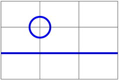
Rule of Thirds

Then you should position your subject (or subjects) either at the intersections (like the blue circle in this illustration), or along the vertical or horizontal lines (like the blue line in this illustration). So, according to this rule, for example, the picture below on the left is better than the one on the right:
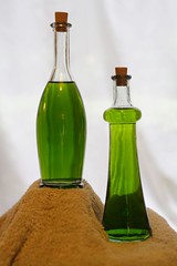
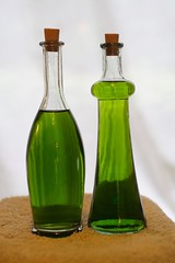
Bottles 2 Bottles 1

Now, this "rule" is the subject of much derision, with many people expounding the fact that using the rule of thirds is not a guarantee of success - and of course, they are right - there are no hard and fast rules in art.

However, it is based on a good principle - don't just point your camera at something and "shoot" it (that's what you do in marksmanship, not photography) - rather think about where the subject should be in the frame so that it looks most interesting. Then if you place the subject smack in the middle of the frame, it's because you wanted to, not just because you didn't think about it.

Remember, your camera is an artist's tool - not a weapon.