
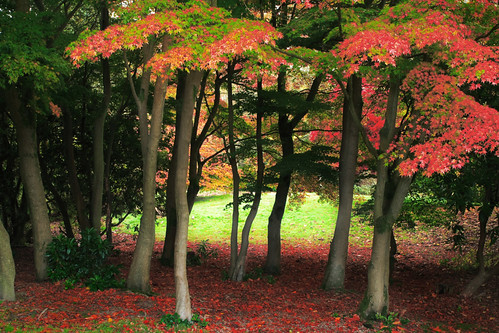
You've got to love autumn - it's such a beautiful time for photography! This is yet another(!) photo from the trip to be park with my sister - a slightly more direct view of the autumn colours this time.
The version you see above is the final image after post-processing - the remainder of this post shows the original photo out of the camera and brief details of the post-processing that I used to get to the final version.
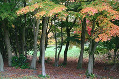
Here is the original version from the camera (Canon 350D; Sigma 24-70 f2.8 lens; ISO100; f14; 4s; manual exposure and focus modes):
In the post-processing, I wanted to really accentuate the autumn colours and the effect of the pool of light on the grass behind the trees. At first glance it probably just looks like I simply increased the saturation and contrast, but the editing of this image actually turned out to be fairly involved. Here's the summary.
- "Developed" the RAW image in DPP with the following settings:
- Exposure: -0.5
- White Balance: Daylight
- Pic style: landscape
- contrast: +2
- Saturation: +2
- Sharpness: 2 (my normal)
- I imported the photo into Photoshop (via JPEG) and created two copies of the background layer:
- First a copy that I sharpened with unsharp mask - set the mode to luminosity and the opacity to 68%
- Second a copy that I blurred slightly (with Gaussian blur) - mode: normal; opacity: 44% - this was to give a slight soft focus effect to the image.
- I then used a series of adjustment layers to fine tune the image...
- Selective Color adjustment layer - this was the main adjustment for bringing out the autumn colours - here's the settings I used - there's nothing specific about the actual numbers - they are just the ones that gave the result that I liked on the screen as I adjusted the sliders:
- Reds: Cyan +13; Magenta +59; Yellow -4; Black +24
- Yellows: C 0; M +14; Y +3; B +22
- Greens: C +6; M +10; Y 0; B +17
- Cyans: [no change]
- Blues: [no change]
- Magentas: [no change]
- Whites: C 0; M 0; Y 0; B -14
- Neutrals: C 0; M 0; Y 0; B -13
- Blacks: C 0; M 0; Y 0; B +1
- Another Selective Color adjustment layer - this one was to bring out the reds in the leaves on the ground so they complimented the leaves on the trees a bit better. I used the layer mask so that only the relevant areas of the ground were affected by this adjustment layer (filled the layer mask with black and then used a soft brush at lowish opacity to paint on white as appropriate). Only the Reds and Greens were adjusted this time:
- Reds: C -72; M 0; Y +26; B +20
- Greens: C 0; M +14; Y 0; B +18
- Next a Hue/Saturation adjustment layer to tone down the brightness and saturation of the bits of greenery at the base of the trees right in the foreground (they stood out a bit too much for my liking and were a bit distracting). Only the Yellows and Greens were adjusted:
- Yellows: Hue 0; Saturation -50; Lightness -23
- Greens: Hue 0; Saturation -47; Lightness 0
- Next I used Curves adjustment layer to lighten the trunks of the trees - I moved the black point up a bit (input 0; output 34) and added another point to give a slight upward curve to the line. I used a layer mask to restrict the effect of this adjustment to the tree trunks only.
- This was followed by another Curves adjustment layer to brighten the grass in the background slightly. Again I used the layer mask to limit the effect to the grassy area only.
- Then I used yet another Curves adjustment layer - this time to "burn in" (darken) some of the corners of the image to give it a subtle vignette effect - mainly in the bottom two corners. As usual the extent of the effect was controlled by painting on the layer mask.
- Finally, I added another Hue/Saturation adjustment layer - I felt that the reds in the trees had become a little too saturated, so wanted to tone them down a bit - I only adjusted the Reds with Saturation set to -37. I also nudged the Hue up +6 to make the reds slightly warmer. The layer mask was used to avoid affecting the leaves on the ground as I was happy with those as they were.
- Selective Color adjustment layer - this was the main adjustment for bringing out the autumn colours - here's the settings I used - there's nothing specific about the actual numbers - they are just the ones that gave the result that I liked on the screen as I adjusted the sliders:
As I said above, the editing of this image proved to be a little more involved than I had originally anticipated - particularly with all the editing of layer masks that was involved. I suspect (as often happens) that I could have achieved this result is slightly fewer steps (for example, that final adjustment layer could probably have been avoided by various adjustments to the settings of some of the others). However, the actual process of editing is quite experimental (tweaking a slider here, adding another adjustment layer there), so it's unusual to find that I get everything "correct" right from the start - after all, that's half the fun of it!
No comments:
Post a Comment