
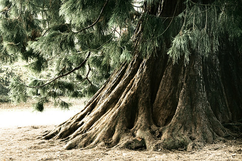
These are (obviously) two versions of the same photo - I first created the black and white one and then worked on that a bit more to get to the coloured one. I'm still not really sure which I prefer, so I thought I'd post them both for you to see.
The rest of this post shows the original photo and gives a brief description of the post-processing work involved.
Here is the original version from the camera (Canon 350D; Sigma 24-70 f2.8 lens; ISO100; f10; 2s; manual exposure and focus modes):
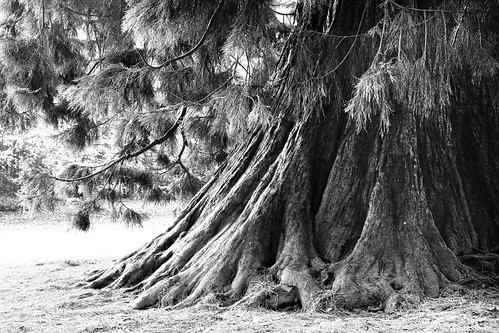
The first main step was to convert the image to B&W:
- "Developed" the RAW image in DPP with the following settings:
- White Balance: 4700K (that gave slightly warm colours that I thought would convert reasonably well to B&W)
- Contrast: +2
- Sharpness: 2 (my usual setting)
- In Photoshop, I first ran an action that I have that extracted all the various individual channels into separate layers.
- For this image I used the Green channel layer as the base for my final B&W image.
- Over the Green channel, I used the Black Max channel (i.e. the black channel from the image converted to CMYK with max black setting) - this layer was set to multiply mode, and I used a layer mask to reduce the strength of this on some of the darker areas of the tree on the right hand side of the image.
- The last channel I used was the copy of the Blue channel as a layer set to Overlay mode with opacity at 30%
- Over these layers, I used a Curves Adjustment Layer with a layer mask to strengthen the light tones in that same right hand side area.
- Finally I created a blank layer, filled it with mid grey (H=0; S=0; B=50%), set it to overlay mode and added some Gaussian Monochromatic noise (Filter > Noise > Add Noise) to give the image more of a gritty feel.
The coloured version was created from the B&W version as follows:
- I created a flattened copy of the image and converted that to a Tritone image (to do this you need to first convert the image to "Grayscale" mode and then convert it to "Duotone" mode - that then gives you the option to actually convert to Monotone (1 colour) Duotone (2 colours), Tritone (3 colours) or Quadtone (4 colours)
- For the Tritone, I used:
- Black (basically a straight line curve from bottom left to top right)
- Green - Pantone 349 CVC - similar curve to the black but slightly curved up.
- Yellow - Pantone 100 C - this was a bell-shaped curve so the yellow was applied mainly to the mid to light tones.
- Once I had the Tritone image, I converted it back to RGB again for further editing.
- Finally I created a duplicate of the original image over the Tritone coloured layer, set the layer mode to "Color" and dropped the opacity until I got a final result that I liked.
No comments:
Post a Comment